You wrote the perfect ad. The targeting is dialed in, the offer is sharp, and the click-through rate is beating your own benchmarks.
Then the visitor lands, and they bounce in four seconds flat. Not because your ad lied. Because the page it sent them to had nothing to do with what they just clicked.
This is the landing page trap, and it’s one of the most expensive, least-diagnosed leaks in paid advertising. Agencies love to report on impressions and click-through rate because those numbers almost always look good. What they rarely show you is the page those clicks landed on, and whether it was built to close or just built to exist. This guide shows you exactly what separates a page that converts from one that quietly burns your ad budget. It’s the practical companion to our pillar guide, The Ad Waste Audit, which covers the full system behind wasted spend.
What Is the Landing Page Trap, and Why Do Great Ads Fail on Bad Pages?
The landing page trap is sending paid traffic to a generic page instead of a dedicated one built for that exact ad. A visitor who clicks a specific offer expects a page that continues that exact message. Send them to your homepage instead, and they have to hunt for what they came for, so most just leave.
The rest of this guide breaks down exactly what a page needs to finish that job, and how to know if yours is failing.
Is Your Landing Page Losing the Clicks You’re Paying For?
We audit your current landing pages against message match, load time and conversion best practices, and show you exactly what’s costing you.
The Homepage Mistake: Why “Just Send Them to Our Site” Fails
Here’s the scenario that plays out thousands of times a day. Meridian Cybersecurity runs an ad for “Enterprise Cybersecurity Audits.” It’s a good ad, tightly targeted at IT directors with real budget authority, and it’s getting clicks. But every one of those clicks lands on Meridian’s homepage: a navigation bar, a mission statement, a careers link, and a generic “Our Services” dropdown somewhere in the mix. The visitor has a singular, high-urgency intent, and the homepage is answering a completely different question.
Your homepage is built to orient a stranger to your whole business. A landing page is built to finish one specific conversation your ad already started. Conflating the two is the single most common reason conversion rate optimization best practices always start with the same instruction: never send paid traffic to your homepage. Meridian’s conversion rate on that campaign was sitting at 1.8%, well below what the keyword’s intent should have produced, and the team had no idea why until someone checked where the clicks were actually landing.
Anatomy of a High-Converting Landing Page
So what does a page that actually finishes the job look like? The anatomy of a landing page that converts comes down to a short list of non-negotiables, not clever design tricks.
Message Match: The Rule Most Pages Break
If your ad promises “Free 2026 Tax Planning Guide,” your headline needs to deliver exactly that, in roughly the same words, the instant the page loads. Any gap between what the ad promised and what the headline says creates a half-second of doubt, and doubt is where bounces come from. This single fix, matching your headline to your ad copy word for word, is consistently one of the highest-leverage changes you can make to landing pages that convert, and it’s a core finding behind the Nielsen Norman Group’s usability research on why visitors judge a page’s relevance within seconds of arrival.
One Goal, One Page, No Exit Ramps
A high converting landing page asks for exactly one action. Not “call us, download this, or follow us on social,” three competing calls to action that each dilute the others. Pick the single next step you want, and remove everything that offers an alternative path, including your main site navigation. Every link you leave on the page is an exit ramp away from the conversion you paid for.
Bounce Rate vs. Exit Rate: What These Numbers Are Actually Telling You
Before you can fix a landing page, you need to read its numbers correctly, and this is where most people mix up two different metrics.
What is the bounce rate in SEO and analytics terms? It’s the percentage of visitors who land on a page and leave without taking any further action, viewing no other page, clicking nothing. For a landing page, a high bounce rate usually means a message match or relevance problem: people arrived expecting something the page didn’t deliver.
Exit rate vs. bounce rate is the distinction worth knowing: exit rate measures how often a page is the last one in a session, regardless of how many pages the visitor viewed before that. A high exit rate on your “thank you” confirmation page is normal and expected. A high bounce rate on your landing page is a warning sign.
What counts as a concerning number? There’s no single universal bounce rate benchmark or landing page bounce rate benchmark that applies everywhere, it varies by industry and traffic source, but a landing page bouncing well above 60-70% on paid traffic is usually telling you something is broken in message match, load speed, or mobile usability, not that your offer is bad. Meridian’s homepage, for what it’s worth, was bouncing paid visitors at 74%.
How to improve bounce rate (and how to reduce bounce rate) on a paid landing page, in priority order:
- Fix message match between ad and headline first. This is almost always the biggest lever.
- Check your mobile experience specifically, since most paid traffic arrives on phones.
- Cut your page load time. Every extra second of waiting pushes more visitors to leave before they see anything.
- Remove navigation links and competing calls to action.
Is Your Bounce Rate Telling You Something?
We diagnose exactly why visitors are leaving, message match, speed or mobile friction, instead of guessing at a redesign.
Conversion Rate Optimization Best Practices: The CPA Multiplier
Our pillar guide makes a specific claim worth putting real numbers against: that lifting a landing page’s conversion rate from 2% to 4% cuts your cost per acquisition in half, without spending another dollar on ads. That math is simply true, and it’s why conversion rate optimization is often the highest-leverage lever available to a business already running ads, more reliable than trying to find cheaper clicks.
For context on what you’re actually working against, Unbounce’s Conversion Benchmark Report, drawn from 57 million conversions across more than 41,000 landing pages, puts the median landing page conversion rate at 6.6% across all industries, though it varies sharply by sector: financial services pages convert at a median of 8.4%, while SaaS pages trail at 3.8%. If your page is sitting well below your industry’s median, that gap is where your CPA is quietly bleeding out.
Here’s what that gap looked like for Meridian once the team built a dedicated page, matched the headline to the ad word for word, and stripped the navigation: conversion rate went from 1.8% to 5.1% on the same ad spend, same targeting, same bids. Same dollars in, nearly three times the qualified leads out.
To increase website conversion rate and improve website conversion rate on a specific page, work through these in order of typical impact:
- Tighten message match (covered above)
- Shorten your form to the fewest fields that still qualify the lead
- Add a single, clear, risk-reducing proof point (a guarantee, a specific result, a credible number)
- Make your one call-to-action impossible to miss above the fold
- Fix load speed, especially on mobile
PPC Landing Pages vs. SEO Landing Pages: Do They Need to Be Different?
Yes, and understanding why changes how you build each one.
PPC landing page optimization and pages built for landing pages for Google ads specifically are built for one audience arriving in one mindset, often with a time-limited offer, and they’re allowed to be aggressively narrow and single-purpose, since every visitor arrives via the exact ad you control.
Do landing pages help SEO? Generally, not much, and that’s by design. A true PPC landing page is usually set to no index, stripped of navigation, and built purely for conversion, none of which helps organic rankings. Google’s own guidance on thin content favors substantial, people-first pages for ranking purposes, which a tightly stripped PPC page deliberately isn’t built to be. If you want a page to rank organically, it needs internal links, broader on-page SEO structure, and content depth, elements that actively work against a tight, single-purpose PPC page. Trying to make one page serve both jobs well is how you end up with a page that does neither.
Want a Page Built to Convert, Not Just Exist?
We design, build and test dedicated landing pages matched to each campaign, so your ad spend doesn’t leak out through a generic page.
How to Test and Improve: A/B Testing, Tools and Analytics
You shouldn’t be guessing which version of a page performs better. Landing page testing, specifically A/B testing for landing pages, is how you replace opinion with data.
The basics of landing page split testing:
- Test one variable at a time, a headline, a CTA button, a hero image, not a full redesign all at once, or you won’t know which change actually moved the needle.
- Run the test long enough to reach a meaningful sample size before declaring a winner.
- Start with the elements most likely to move conversion: headline and message match first, form length second, visual proof third.
For landing page analytics and landing page analysis, track beyond the raw conversion rate: time on page, scroll depth, and where in the page people stop engaging all tell you where attention is being lost. Most major landing page optimization tools (your ad platform’s own landing page reports, your analytics suite, and dedicated page builders with built-in testing) surface these metrics without custom development.
Dynamic landing pages, pages that automatically swap headlines or offer text to match the specific ad, keyword or audience that sent the visitor, take message match from a one-time fix to a systemized one. They’re worth the setup once you’re running more than a handful of campaigns at once, since manually building a unique page per ad doesn’t scale.
Landing Page Copywriting: Say the One Thing They Came For
Good landing page copywriting isn’t about clever lines. It’s about ruthless clarity. The visitor arrived with one question in mind, “can this solve my specific problem,” and every sentence on the page should move them closer to a confident yes.
A simple structure that holds up across industries:
- Headline: restates exactly what the ad promised.
- Subheadline: adds the one detail that makes the offer credible (a number, a timeframe, a guarantee).
- Three to five benefit points: what changes for them, not a list of your features.
- One proof element: a testimonial, a stat, a case result.
- One call to action, repeated at the top and bottom of the page, worded identically both times.
Cut anything that doesn’t serve one of those five jobs. A landing page is not the place for your company history.
Common Landing Page Mistakes (That Are Easy to Fix)
The recurring list of landing page mistakes we see most often, roughly in order of how much damage they do:
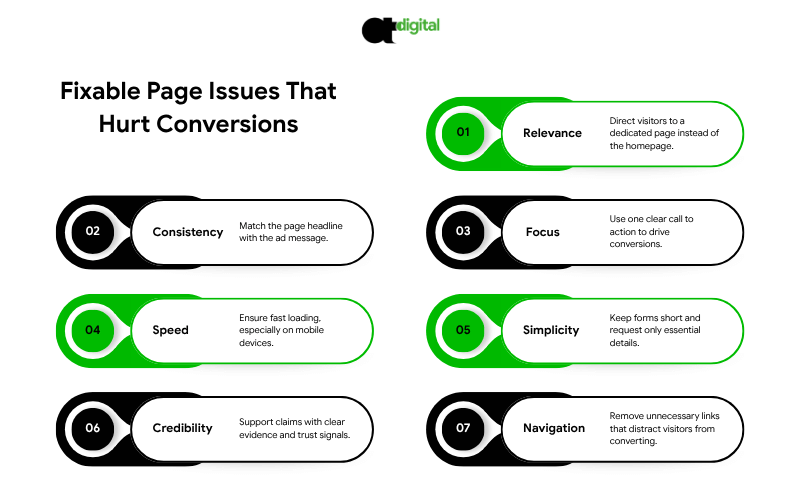
- Sending traffic to the homepage instead of a dedicated page.
- The headline doesn’t match the ad that drove the click.
- Multiple competing calls to action diluting the one conversion you actually want.
- Slow load time, especially on mobile, where most paid traffic lands first.
- Forms with too many fields, asking for information you don’t actually need yet.
- No proof element, nothing specific backing up the claim being made.
- Full site navigation left in place, giving visitors an easy way to wander off before converting.
Most pages have two or three of these at once, which compounds the damage rather than adding to it. Meridian had four.
DIY vs. Hiring a Landing Page Optimization Agency
You can fix the basics above yourself with a page builder and some discipline. Consider bringing in a landing page optimization agency, landing page optimization company, or an independent landing page optimization expert when:
- You’re running multiple simultaneous campaigns and need dedicated pages for each, fast
- You’ve fixed the obvious issues and conversion is still below your industry benchmark
- You need proper A/B testing infrastructure, not guesswork
- Your team doesn’t have the design or copywriting bandwidth to iterate quickly
If you’re comparing landing page optimization services, ask any landing page optimizer you’re evaluating three things before signing: how they’ll measure success (conversion rate and cost per acquisition, not just “engagement”), whether they build dedicated pages per campaign or one reusable template, and how quickly they can turn around a new page when you launch a new ad. For a team that handles the ad account and the landing pages it feeds as one connected system, see our PPC management services.
The Verdict: Your Ad Already Did the Hard Part
Here’s the frustrating truth about the landing page trap: by the time a visitor clicks your ad, the expensive work is already done. You paid for the click, won the auction, and earned their attention for a few seconds. A broken landing page throws all of that away in the final step, the one that should have been the easiest to control.
Meridian’s fix took a few weeks to build and test. It didn’t touch targeting, didn’t touch bids, didn’t add a dollar to the budget. It took the same traffic they were already paying for and nearly tripled what it produced. That’s the entire case for fixing this before anything else: run the math on your own numbers, and if lifting your conversion rate from 2% to 4% cuts your cost per acquisition in half, every dollar spent fixing the landing page makes every future ad dollar worth twice as much. Compare that to chasing cheaper clicks, which only ever buys you the same conversion rate at a slightly lower price.
You don’t need a bigger ad budget to fix this. You need the page at the end of the click to finish the conversation your ad started. Our landing page audit checks your message match, load speed, mobile experience and form friction against what your industry actually converts at, and tells you exactly where your current pages are leaking budget. Book it before your next campaign sends another round of paid clicks to a page that isn’t ready for them.
Stop Paying for Clicks Your Page Can’t Convert
Engineering-grade account analysis. Pure mathematics. Zero sales scripts.